Most of us have a difficult time, when deciding the color combination for a project. "Does this match?" is the one question we ask ourselves repeatedly. So, to make things a little easy, I chose to share a couple of useful infographics, and a tutorial on the color theory as part of my last #craftykickstart16 post.
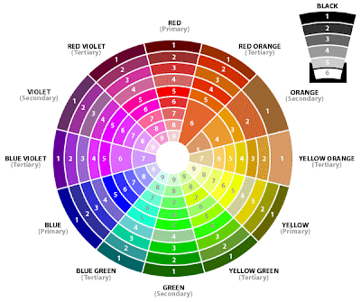
I'll start with the Tutorial, posted by Crafty Cardmakers in 2009! (yes, that long ago). It is a short, yet extremely informative post where they start by explaining common terms like Tone, Tint, Shade, followed by the 6 color schemes, and conclude with the color wheel, showing a range of tints and shades. (Reference image below linked from Crafty Cardmakers)
Next, is this graphic found on tugunicorn.blogspot.com. It starts with the wheel, and goes on to explain the different effects one can create using certain color combinations. Very useful as a reference.
Last, but not the least is this very comprehensive infographic by Kissmetrics. Though it is focused towards color combinations in web design, we as crafters can take a lot of useful pointers from it.
I hope this information helps you in choosing the right colors, in a shorter time.
This is my last post for #craftykickstart16, so be on the lookout for Amina, Amna, and Jaihan's post. We had a lot of fun interacting with all of you, and sharing all that we could in this time. We will, inshallah, continue to share and inspire, but not at the same pace. Hoping all of you are charged, and ready to participate in the Artful Crafting Monthly Challenges, which will resume from February inshallah.
Happy Crafting!
xoxo


